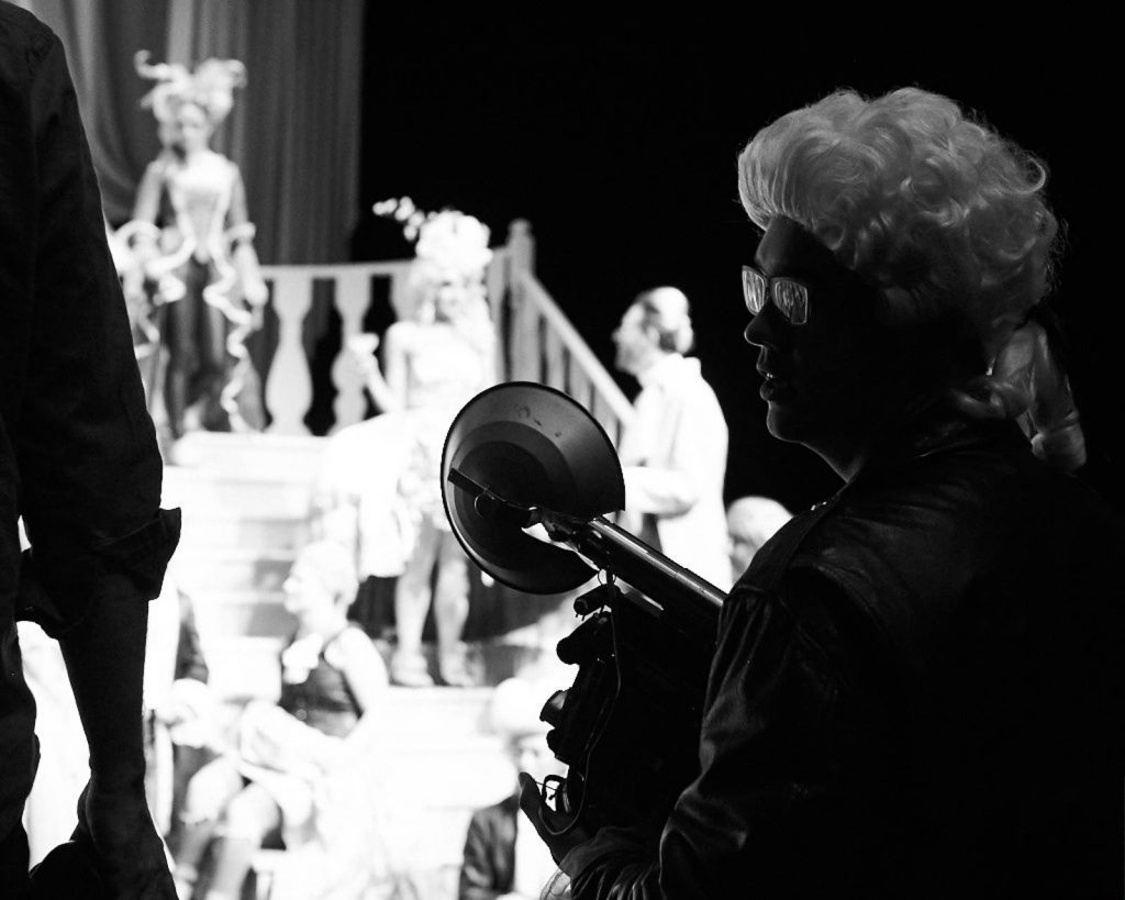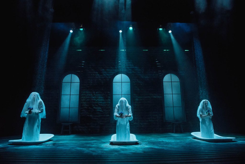
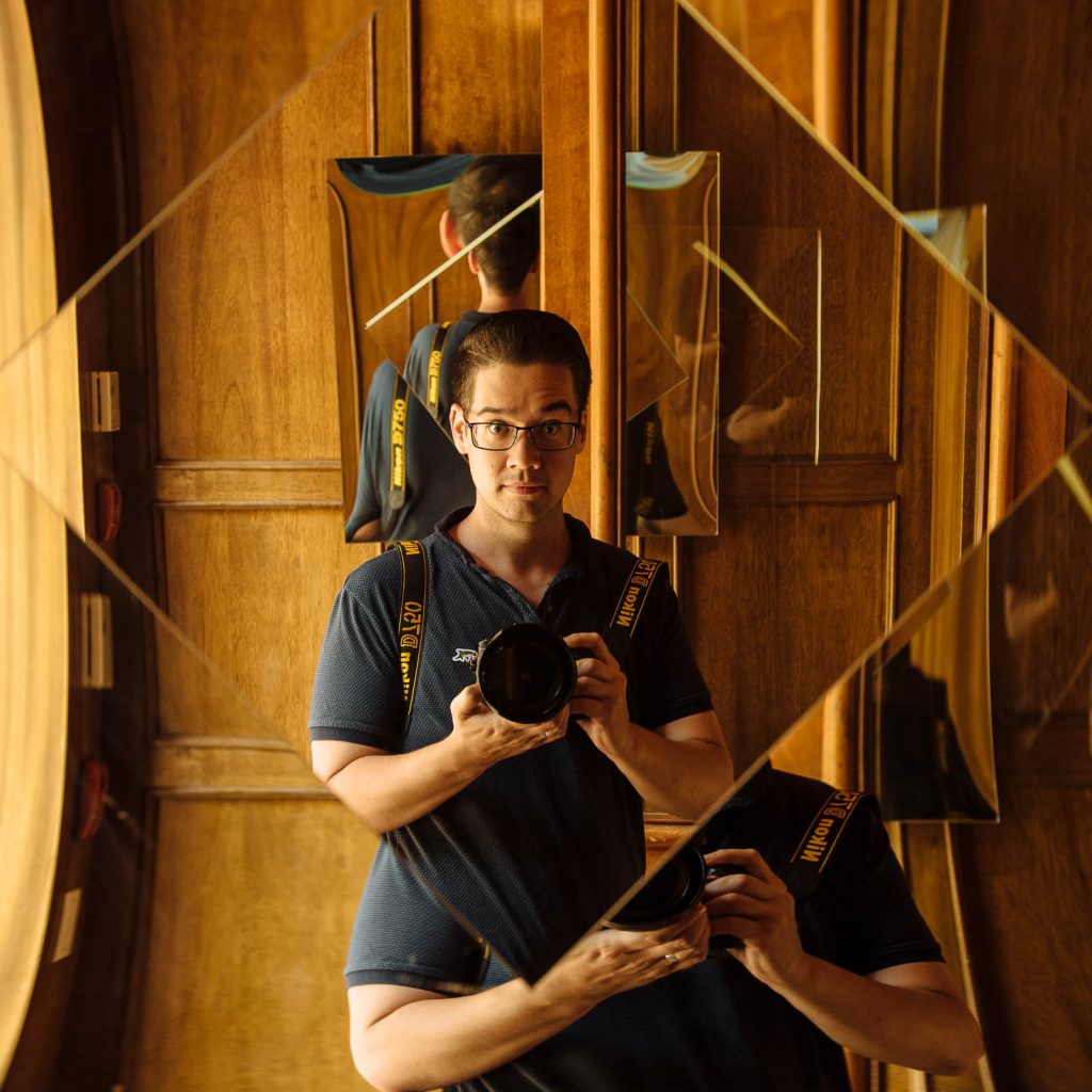
Tim Nguyen’s work is striking and vivid and the images remain with you long after you’ve seen them. He’s one of the most sought after performing art photographers in Calgary and his work ranges from capturing all the energy and emotion of live theatre to the intimate and personal process of portraiture. You can see more samples of his work and contact him through his website: Tim Nguyen
I sat down with Tim at his home office to talk with him about his theatre work, his award-winning fine art photography series Lumination, and his Rococo Punk project for the School of Creative and Performing Arts at the University of Calgary.
JAMES HUTCHISON
So, before you became a photographer you were thinking of acting as a career and you went to the University of Calgary because you were bitten by the acting bug.
TIM NGUYEN
I was.
JAMES
What type of acting? Comedies? Dramas?
TIM
I discovered very early on that I’m not funny on stage. My comic timing is atrocious. I’m relatively amusing in conversation, I would like to think, but on stage, it’s the patter or the timing, the thinking on my feet – just doesn’t happen the same way. So, I made peace with that fairly early on, and I decided that I would try my hand at more dramatic roles. Angsty roles. Because I was twenty and I wanted to talk about my feelings on stage.
So, I got to the middle of third year and it became really clear to me that this was not the right path that I was on. I’d botched a couple of auditions that I thought I was a shoe-in for, and when the casting came out I was at the bottom of the list. So, I got handed a lesson. A harsh lesson. And it left me time to reflect and realize that this wasn’t the right thing for me. I felt like I was moving vaguely in the right direction, but the artistic direction was slightly askew of where it needed to be.
So, after having this very difficult conversation with a prof of mine, who’s now retired from the university, I realized that it was actually okay to change directions and to admit that I hadn’t been approaching things quite right and to move on to the next thing. And it was a breath of fresh air, and at the same time, it was a bit of a kick in the pants. But I was also sort of lost at sea. After I graduated, I worked in retail for a while. I sold cameras. I did construction. I travelled Europe for a little while. And when I got back from Europe a few photo jobs just landed on my desk and then snowballed into bigger and bigger things.
JAMES
When did you start to realize you had an eye for composition?
TIM
I have a really specific point in time that I can call back to. I think it was grade eleven where I had this little box camera. It was basically a reloadable disposable camera. And that was what I carried around in high school for the most part. And there was a day where my girlfriend at the time and myself were downtown in the Devonian gardens with the late afternoon sun spilling in through the windows and just beautiful shadows coming across the old Devonian gardens. They had those big angled skylights on the one side and this really stark tile. And for whatever reason, I asked her to go and sit over inside the shadow. Inside this specific area. And I took four pictures on this little box camera and when I got them back that was it. It was this lightning moment where I looked at what I had shot and what I was trying to do and I looked at the shapes – the forms – the shadows – the light and I knew that there was something there that I needed to keep investigating.
JAMES
It’s interesting, you said you walked in there and you’re looking at the shadows. You’re looking at the light. You’re looking at the textures. You’re looking for that place where you can put the subject and something magical is going to happen. Because most people would not see that and so much of photography is understanding or being attuned to the light.
TIM
Once the camera-specific elements were muscle memory everything else just became about the composition. I don’t spend much time or energy on getting my settings dead on when I’m shooting theatre anymore because it’s just automatic for me.
JAMES
And when you’re doing production stills they’re running the show.
TIM
I get one crack at it. I have not read the script. I haven’t seen the set. And that is the only day of the production that I’m in house.
JAMES
Why do you choose not to know the play before you go shoot it?
TIM
It didn’t start off as a conscious choice. It started off as a matter of opportunity. The first company that I shot for was Downstage when they first formed. Simon Mallett, who founded the company, was doing his masters at the same time I was an undergrad. So, we’d known each other in university and even in school I was the guy with the camera. And he started bringing me down to the Motel Theater to cover shows that he was producing. And these are shows that were being done with Home Depot lighting and bits of pipe and drape. There was no production value to them. They were just people trying to do politically motivated theatre, and they had a statement they needed to make.
JAMES
Right, because Downstage is based on conversation. We want to start a conversation about a particular subject, so they’d create a show.
TIM
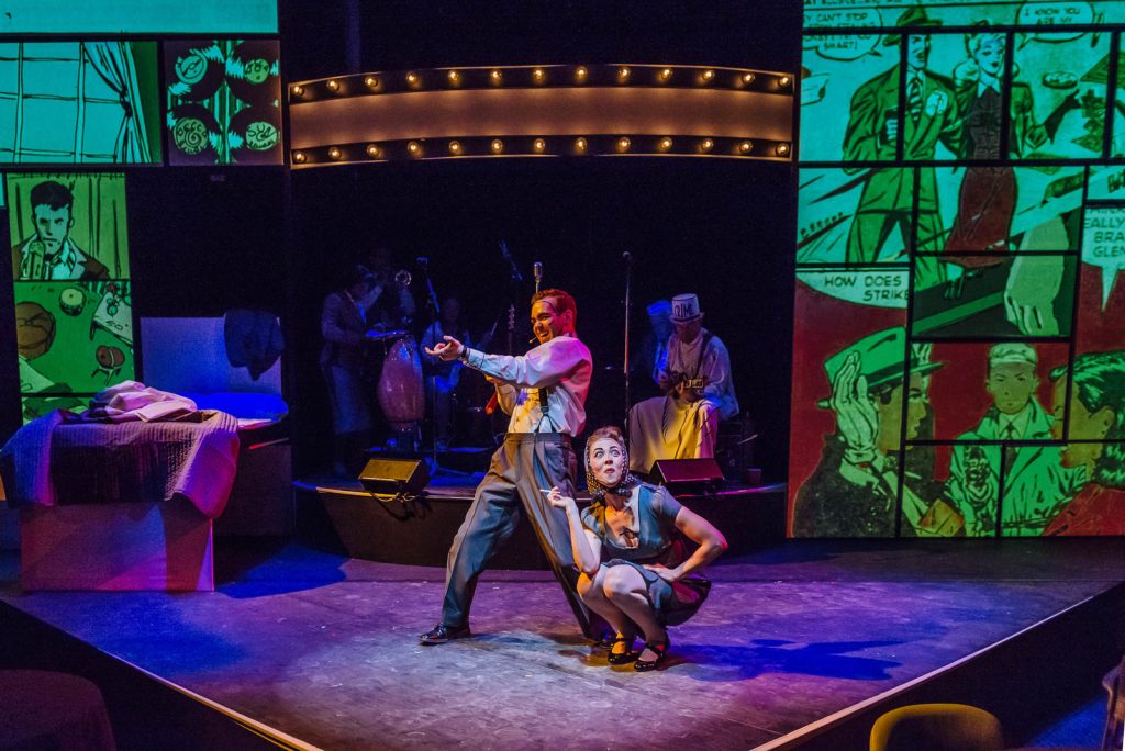
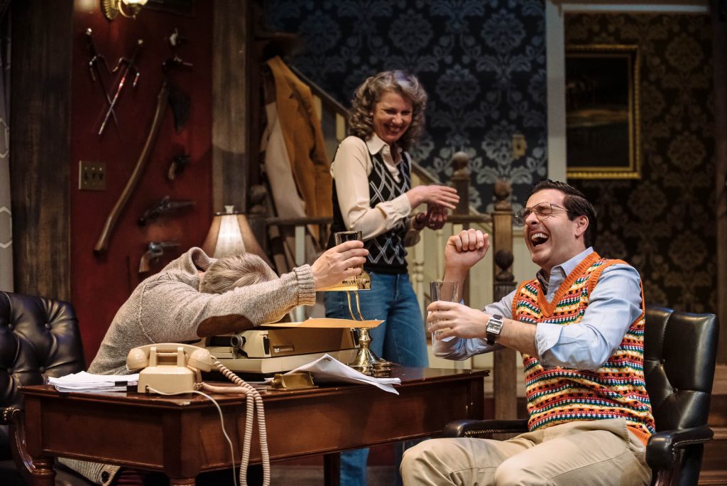
Right from the get-go that was their mandate. So, I was given the freedom to just show up. I was given a couple of bucks for my time. It was the starting point, the foundation of learning how to tell a story through still imagery and finding my own aesthetic inside of that as a medium. Because it’s one thing to just document a production as it’s happening. I could stand in the middle of the house and point my camera at various corners of the stage, but it’s going to look like that’s the level of effort that I put in. When I go and I cover a production I am running the entire time. I’m sweating as much as the actors on stage are, and it’s been quite a while since I’ve been concerned with how much noise I’m making. If anything, I’m akin to phones going off, candy wrappers crinkling, or a baby crying in the house. But I’m the only person in the audience so it’s less problematic.
JAMES
And you’re capturing something that’s going to be here and then gone anyway – and yours is the record. It’s an extremely challenging thing to get good photographs of a stage performance because you’re trying to capture particular moments – particular connections between the characters – or particularly revelations of a character, and those are fleeting and fast. So, I imagine your time as an actor, has in some ways, informed your shooting of plays.
TIM
A hundred percent it has. One of the things that I noticed early on was my sense for where an actors blocking was going to go – where they were going to travel on stage. I was effectively predicting it a lot of the time. So, I’m trying to stay a step ahead of the actors and where they’re travelling, but then I have to have the right composition to complement their eyeline for their intention plus whoever they’re speaking to. It’s a hell of a challenge.
JAMES
It’s spontaneous, yet there’s a certain structure to it
TIM
Very much so.
JAMES
How would you summarize what you’re trying to capture in the frame when you shoot a play?
TIM
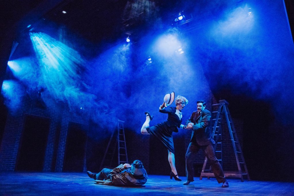
When I’m shooting a play I’m not really paying a ton of attention to the text. I don’t fully absorb the storylines most of the time. I’m looking for moments of heightened emotional responses from the actors. Moments of high intensity. High action where lighting effects or special effects are going to go off. Things like that. But at the same time, those are really particular moments. Eighty percent of the play is still covered beyond that.
When I’m looking at the rest of the show what I’ve realized is that I’m not really looking a hundred percent at what’s happening through the viewfinder either. I kind of relax my eyes – kind of like when you take your glasses off. I relax my eyes a bit and I look at forms, negative space, where the highlights are and how elements complement one another, and I’m composing around that for the most part. So, it’s a bit of experience based, and it’s a bit of a sense for how shape and form and colour should fit and interplay, and those I think are the main approaches that I’m using these days
JAMES
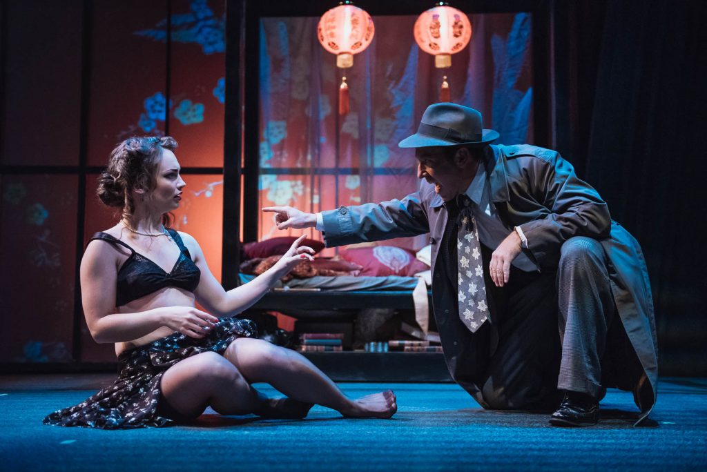
In addition to doing production stills you’re also doing some advertising work for theatre companies with your photography. Let’s talk about the new season campaign you created for Vertigo.
TIM
This has really been a natural progression of what I’m doing in the performing arts community. I’ve been doing the production stills and headshots for ages and doing advertising and poster work for the arts isn’t completely brand new for me, but it’s relatively recent.
One of the conversations I had with Vertigo towards the end of last season was that they were getting a little tired with their existing imagery and style especially when Lunchbox and ATP and everybody else was refreshing their brand. So, I presented about eight different styles of artwork that I thought were potentials in one of the pitch meetings with Craig their artistic director and Evelyn and Kendra their marketing people and Darcy who was their graphic designer. The two winning concepts were the lighting style of my own Lumination work which Craig was aware of because I’d actually done a gallery show at Vertigo the season before and had about twenty of the Lumination prints on display there for most of the season.
The other part of this concept was influenced by True Detective, the TV series. The intro and theme has a ton of video compositing that’s done layer upon layer of faces with cityscapes that are sort of washed across them. They kind of look like projections that kind of look like they’re coming from inside the skin. And it’s this beautiful style of work that got copied over, and over, and over again by other people when it was popularized including us to some degree. So, what I ended up pitching to Craig was a combination of those two things. I wanted to do a floating shape and I wanted to create a composite that was tailored to each show.
JAMES
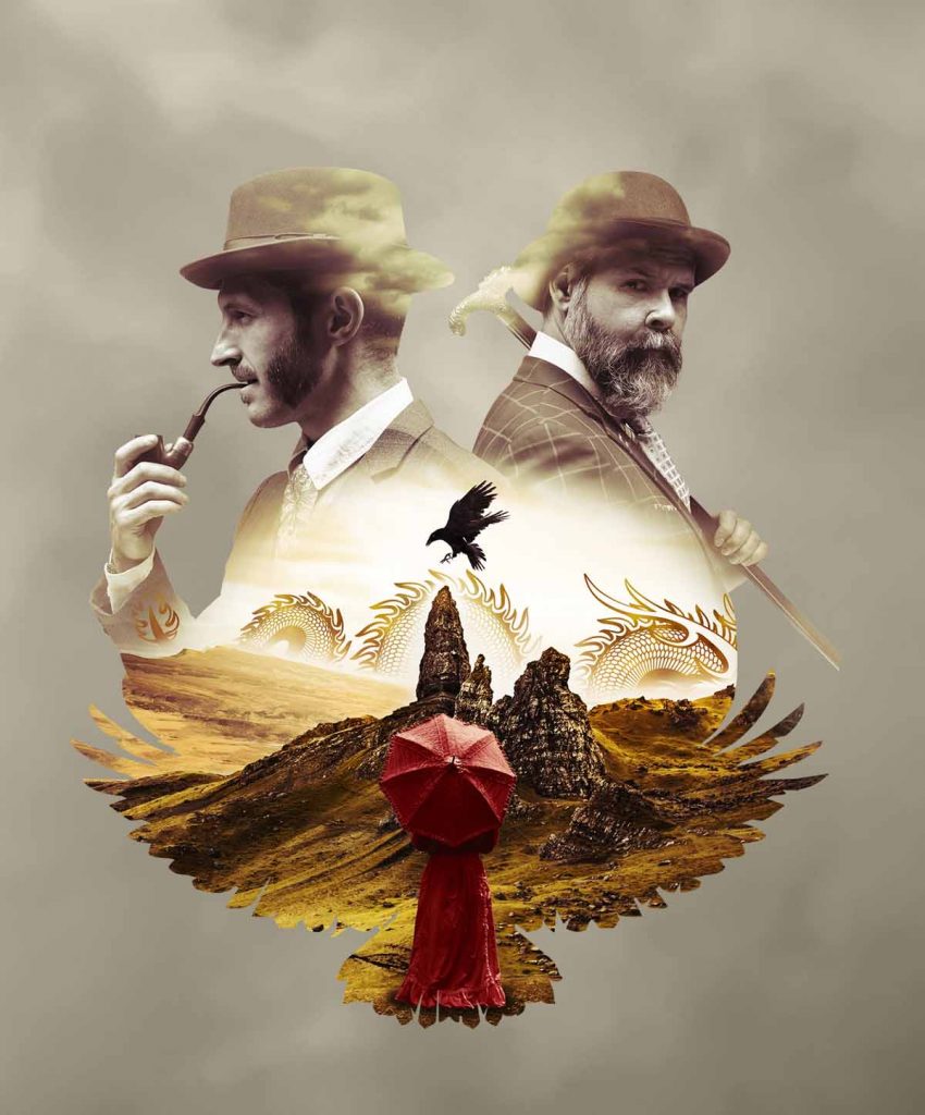
So, there are little clues in your composition about the themes of the show about the subject matter of the show. And right now, we’re looking at the Sherlock Holmes image.
TIM
Sherlock Holmes and the Raven’s Curse. So going with fairly literal imagery to begin with we’ve got the bird’s wings. The raven wing shape moving upwards and then the raven sort of sitting over top of this particular part of the Isle of Skye. The Isle of Skye being one of the main backdrops for the show. And we’ve got Sherlock Holmes and Dr. Watson in the image as well.
JAMES
And then a mysterious woman.
TIM
There’s a mysterious woman of Asian descent. That’s why there’s dragon imagery in the background. At the time of creating this that role hadn’t been cast. So, we were looking for a creative way to incorporate the knowledge that there was going to be a third primary figure without making them identifiable. So, I decided to have her looking out into the scenery and having her back to camera.
JAMES
The great thing about this image is that when I look at it I want to know what this play’s about. It makes me curious. It looks intriguing and interesting. It looks mysterious.
TIM
Yeah, I’m really, really satisfied with how this one came out.
JAMES
Is this type of work something you want to pursue more?
TIM
I think so. This was a lot more satisfying to do than some of the piecemeal stuff that I’ve been doing just to keep bills paid. With this project, I was able to sit down for a longer period of time and concentrate on it and really give it some critical thought about how I wanted the aesthetic to come across.
JAMES
You mentioned your Lumination series. Tell me a little bit about that project and how it got started.
TIM
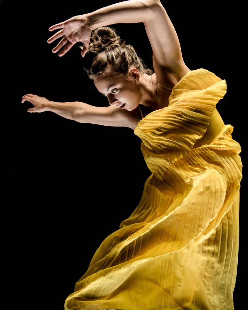
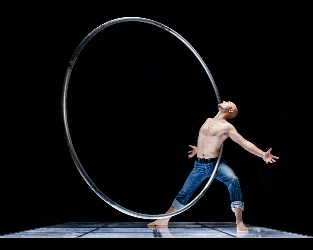
So, Lumination was born from theatre as well. It was inspired by a Downstage play called In the Wake that I documented at the Motel Theater in 2010 and then they took it on tour. The production was entirely presented on a platform. It was five actors on a platform that was about ten by ten and they performed on it for ninety minutes. It was a fairly large chunk of plexiglass with pockets of lights that were on dimmers underneath that they could control and they could colour. And these were all Home Depot lights at the time.
And they did something absolutely beautiful with it. There was shadow play. There was puppetry. There was contact improv and shape creation with their bodies. It was just beautiful to take in. And it led to this immediate thought when I was documenting the play that I wanted to see what I could do with it. I wanted to see what I could do with that style of lighting.
And so, I asked Simon Mallett to borrow that set for probably about a year and a half before he let me borrow it, and I showed up at the Motel theatre one night after they’d done a run, and I put my own lights inside their box, and I put a light overhead. And that was the very first time that I had ever done that look. And it was just called the lightbox project or something like that at the time. I had a dancer, and I had a nude that I had brought to the space, and we just experimented with shape and form and musculature to see how it worked. And it worked out beautifully. Those photos are as good as any of the things that I shot during the two years after that.
And then a couple of years later, I got my own studio space, and I had Anton deGroot who built the set for In the Wake rebuild that stage in my studio. And I had that for three and a half years. I’ve since replaced that with something more robust. Something that’s actually got an acrylic top and I stick lights underneath and point them upwards now.
JAMES
So, what was the evolution of the subject matter then in terms of what you were shooting?
TIM
It didn’t start off as theatre, I can tell you that much. I started off mostly with dancers. I had a fairly good in with Dancers Studio West and a couple of other companies at the time. I was really interested to see what this hard contrast lighting would do with musculature, particularly legs and movement and jumping and that sort of thing. So, dancers were a natural and for the first year that I was doing this project I was asking people to come as they were. I did have some styling on site, but I was mostly interested in seeing who these people were as I was having a brief conversation with them and finding out what made them tick.
JAMES
You were looking to capture something of the person and the personality?
TIM
Yep. So, I was shooting this with a 200-millimetre lens. I was 25 feet away from the set. So, there was a bit of shouting back and forth over music and that sort of thing. But what it did was – it isolated people in space.
So, I just rolled a blank sheet of paper down behind them. And the studio was thirty feet by twelve feet. So, I’m on one end and my crew is sitting behind me and the subjects – they’re on the far end totally by themselves. No props. No sense of background. The overhead lights were on because that was how I chose to shoot all these. So, they didn’t even really have a sense of what the lighting style was like.

TIM
For a lot of these people it was it was a leap of faith and just assuming that I knew what I was doing. To start with I didn’t give people a ton of direction. I asked people not to bring a lot of props. For the most part, it was articles of clothing. It was wigs. Anything handheld was passable, but I wanted to look at people as they were. Or, who they wanted to present themselves as, and sort of play within that realm and see what I could extract from them. And I found that really fascinating. But about halfway into that process the theater stuff starting to creep in.
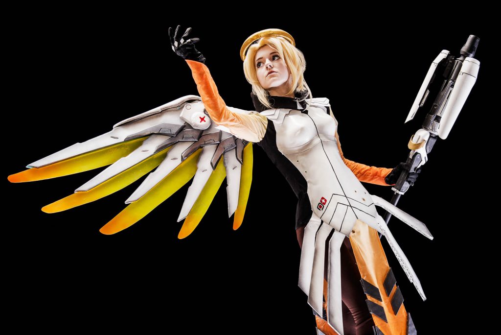
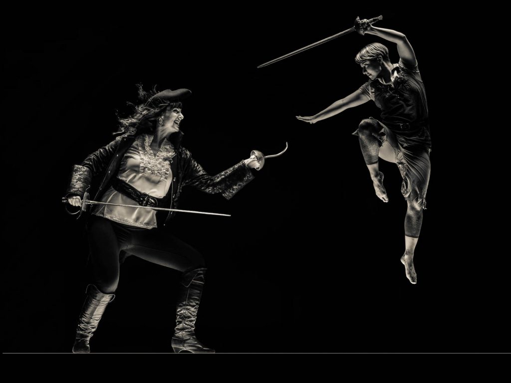
I had the entire crew from Scorpio Theatre come down to see me. They brought swords, shields, chain mail, and axes. They were doing a stage combat based show and there was a bunch of short scenes all stacked together, and each one of the scenes devolved into some kind of big fight. It was super amusing. I really enjoyed their show. And this ended up being their marketing material for it. We ended up creating these long panorama images that were a composite of this person fighting this person. With this person overhead. And this person down here.
JAMES
So, you would shoot people individually or two people at a time and then compose the whole image.
TIM
For the most part, all of these shoots have been two people at the most. In fact, in the Peter Pan one, those two people were photographed six months apart.
JAMES
That’s how Orson Welles used to shoot his films. We’ll do the close up now in Europe and I’ll get the guy in Hollywood six months later.
TIM
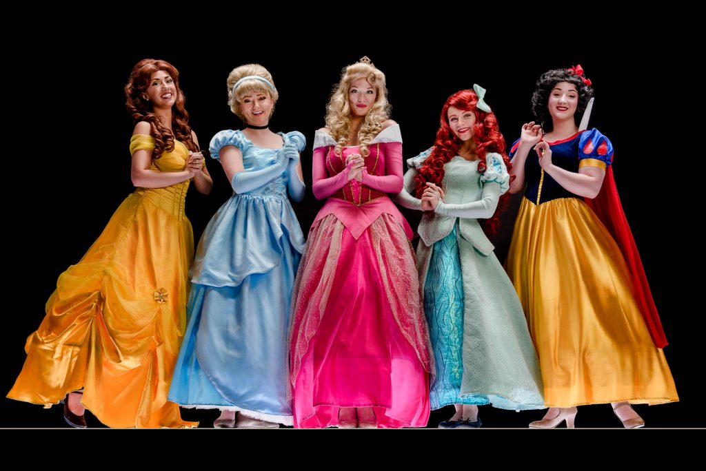
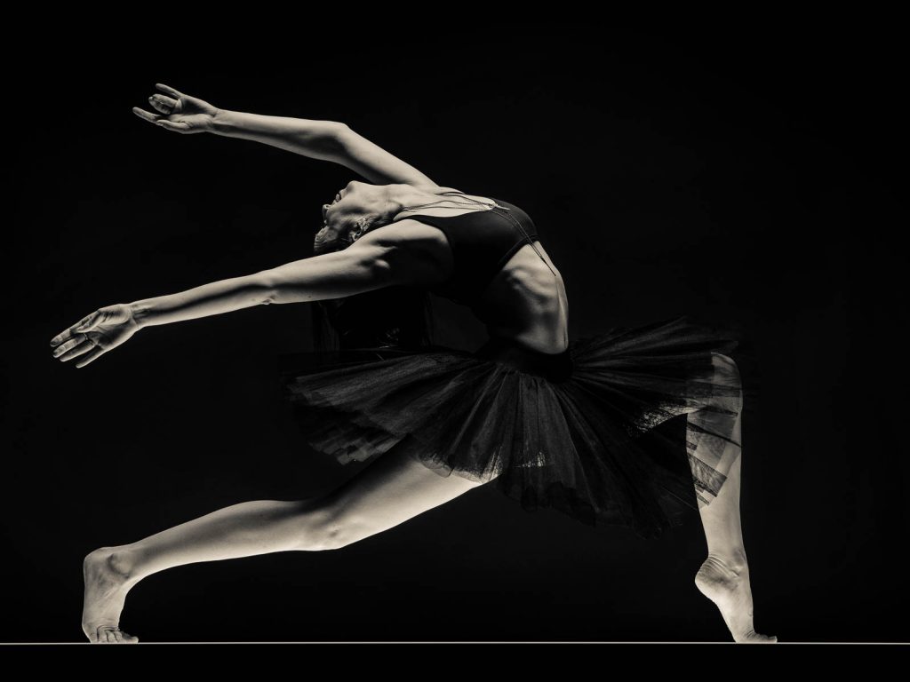
That’s a good comparison, I like that. So that actually touched off a really hard change in what my intention was. I suddenly had people showing up and they were putting on these full characters. For me, they weren’t showing up as themselves. That led to 2017 where all I did was photograph people in cosplay. I did a year’s worth of people in these high colour, cartoony type of outfits, and those were the characters that they wanted to present, and that I found incredibly fascinating. At one point I had nine Disney Princesses show up all at once. So, we spent an entire morning photographing Cinderellas and Ariels and Rapunzels.
JAMES
And then you decided to make a book.
TIM
I did. The book doesn’t have any of the Cosplay work in it, unfortunately. The book is entirely black and white and it is the work that I did between 2012 and 2015. Since that time, I’ve been doing everything in colour.
JAMES
Some great portraits have been done in black and white.
TIM
Absolutely. Some of the best portraits have been done in black and white. For me, black and white changes the way somebody takes in the image. You are not focusing on blemishes, skin tone, bags under the eyes. You’re not focusing on nudity. You’re not focusing on anything other than the texture of an image and where the light is and the negative space. And those are all things that I gravitate towards, quite heavily.
JAMES
So, I’m curious when you’re going to do a portrait and you’re trying to capture somebody – how do you go about doing that?
TIM
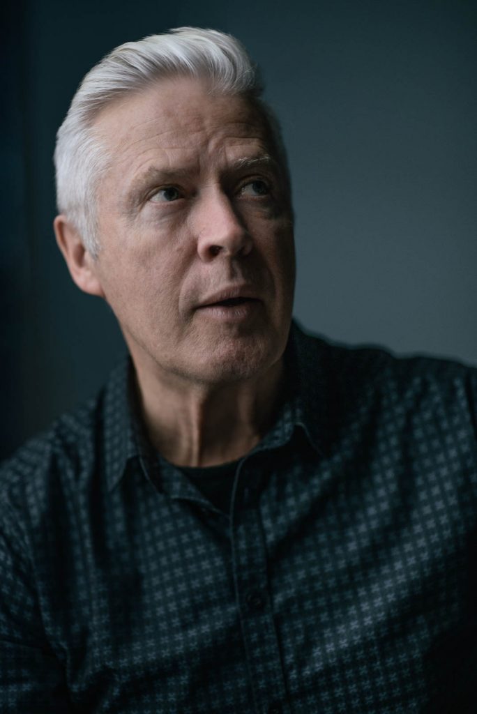
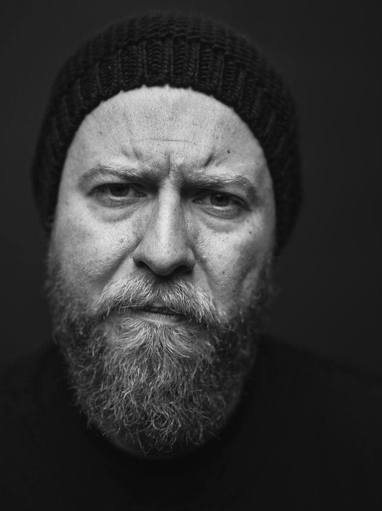
It’s similar to how I approach doing headshots for people. And I think portraiture sort of evolved naturally out of my headshot business. When somebody comes for a professional headshot the first conversation I have with them is how uncomfortable are they being in the studio knowing that they’re about to be on camera? Because despite all of us being performers in one way or another, there is a heavy sect of people that really don’t want to be on camera. They would much rather be behind a keyboard. Behind the lens. Behind the scenes.
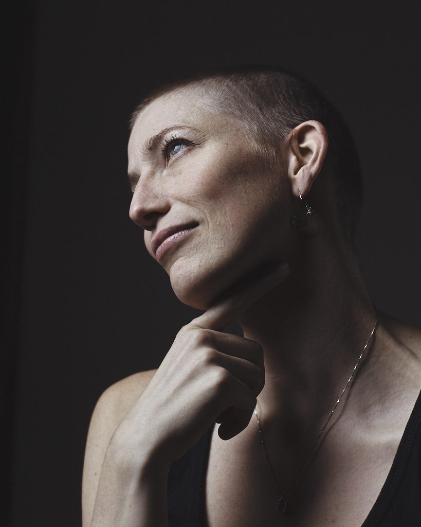
With portraiture, I put a lot of stock into putting people at ease before we even get started. And I feel like part of that is actually my personality. I present myself as very easygoing, very relaxed, low intensity, and that puts people at ease most of the time. So that’s a starting point and the portrait work I’ve been doing for the last year and a half has largely been conversational. So, I have a lot of outtakes, where people’s mouths are moving, or their eyes are darting around, and that sort of thing. And that’s something that I’ve had to teach myself to shoot around.
JAMES
And so maybe you’re capturing the moment when they’re thinking about the question rather than answering the question.
TIM
Those pondering kinds of looks are quite popular.
JAMES
Because they drop the facade. They’re internally in their mind.
TIM
As soon as you get somebody really thinking about something all of the external stuff goes away.
So that is how a lot of my portrait work has been developing over the last year. I’ve been discussing, in advance, with people that are coming for a portrait what subject matter we should get into. And it’s led down some very curious paths including been given some really brutal trauma stories from people. And I’ve been let in on secrets from people that I will never – never redistribute. But it’s also led to this artistic wall that I’ve run into where I’m not totally sure how to present that work now, because of the context of how it was given to me. But I’m trying to find the right voice to put that into the world without exposing people in the wrong sense. The best that I’ve come up with so far is, I think, I’m going to discuss the questions that were asked more than the answers that were given. So, I’m sitting on about a year’s worth of portrait work that’s both beautiful and brutal.
JAMES
Let’s talk a little bit about the project you did for the School of Creative and Performing Arts at the University of Calgary which is being unveiled this Saturday during Alumni weekend.
TIM
The Rococo Punk?
JAMES
Yeah. What exactly is Rococo Punk?
TIM
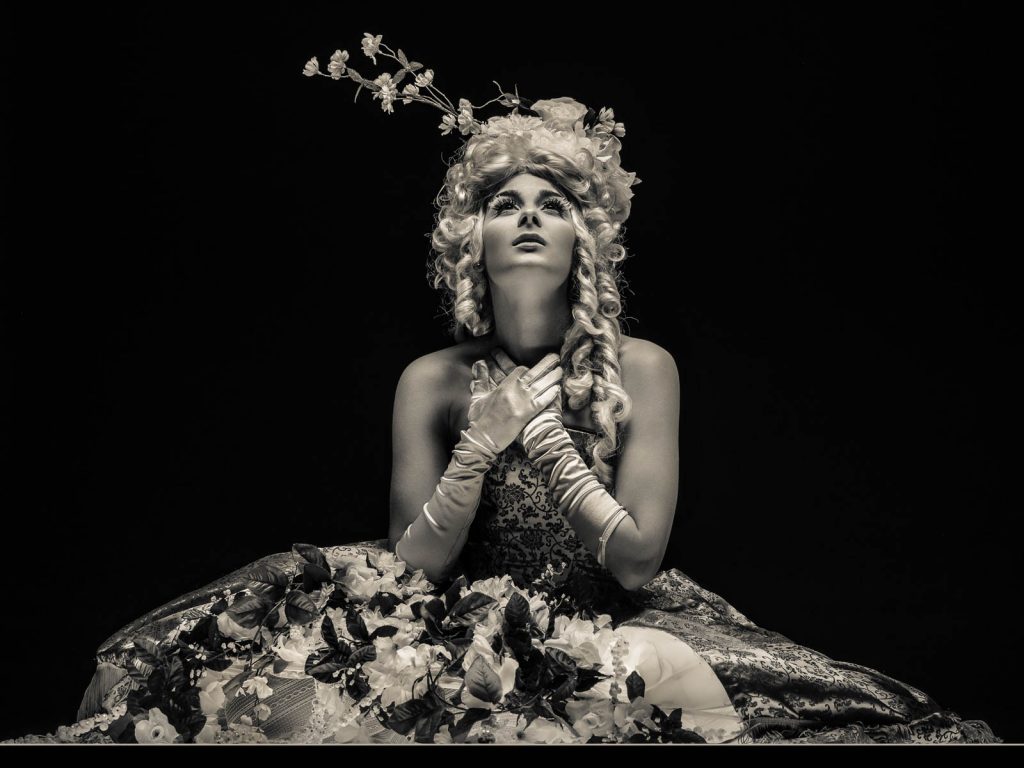
My interpretation of Rococo Punk – as an art style – is effectively the embodiment of Renaissance silliness.
JAMES
I like your definition better than what I read on Wikipedia. How did the project come about?
TIM
I had been developing a Renaissance style of lighting that I had been using mostly on nudes and on portraits, and I wanted to do something broader with that. The first thing I did was rent this dress from the university and I hired Natasha Strickey and we generated that photo. And after she graduated she ended up becoming a good friend of mine. And we’ve done a lot of creative work together like that, that has influenced to a heavy degree, the way that I’ve moved forward.
TIM
And then I had a conversation about a year and a half ago about doing something like that with April Viczko, who directed a show called, The Learned Ladies at the University of Calgary three seasons ago. What I actually pitched to her was that I wanted to get the cast back together from that show and see if we could do a renaissance group portrait with everyone. Unfortunately for me, I hadn’t really considered that some of those actors aren’t in town anymore, or they’ve ceased acting, or they’ve just moved on to different parts of their lives. So that wasn’t really an option.
April counter-offered and suggested we try and see if there’s an event that we could wrap this inside of and get somebody to fund it. And the next time we sat down that was exactly what she had done. The Alumni Association was interested. Alumni Weekend was interested. So, let’s see if we can get some grad students and prominent alumni to come down for this rather than having to get these specific actors.
JAMES
This is a big project.
TIM
Humongous. I had the responsibility of the shooting days, and the post-production was entirely on my shoulders. But there was a team of about five people that did the initial groundwork and gathered the costumes and the casting and did all the fittings. And all of that took about a year and then on Alumni Weekend last year there was a team of 30 people that were working on this plus all the talent that came which for the most part are alumni, faculty and students and includeS 62 different people.
The camera was thirty feet back from the set. And I had it up on a platform on a tripod for the entire weekend. We photographed about two people at a time. It took two full days. It was about 20 hours of photography. And then it took all of October last year to put the image together.
So, this is going to end up as an enormous print that is going to be 60 inches wide that’s going to hang in the Reeve Theatre lobby. So right outside the space where we created it. And that’ll be a permanent installation that we’re revealing on the seventh of September and I’ve got wall space set aside at my studio, which I’ve just finished renovating, and I’m going to have my own copy of this made.
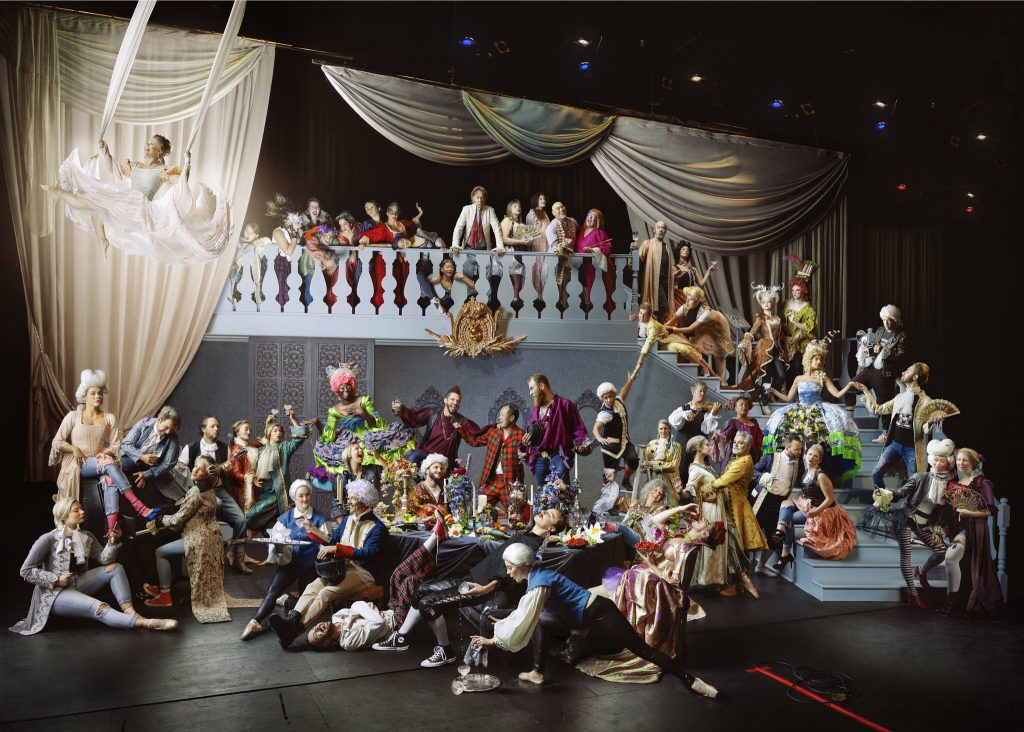
The grand reveal for the Rocco Punk was held on Saturday, September 7th in the Reeve Theatre Lobby during the University of Calgary’s Alumni Weekend. The photograph features University of Calgary alumni from the School of Creative and Performing Arts including: Anton deGroot, Michaella Haynes, Sarah Mitchell, Brad Mahon, Odessa Johnston, Julie Orton, Megan Koch, Cayley Wreggitt, Sadaf Ganji, Brittany Bryan, Jason Mehmel, Connor Pritchard, Marisa Roggeveen, Mark Bellamy, Emily Losier, Michèle Moss, Tim Nguyen, Natasha Strickey, Donovan Seidle, Pil Hansen, Allison Lynch, Tina Guthrie, Laurel Simonson, Jason Galeos, Meghann Mickalsky, Christopher Hunt, Vicky Storich, Clem Martini, Louisa Adria, Shondra Cromwell-Krywulak, Allan Bell, Allison Weninger, Kaili Che, Megan Stephan, Lisa Russell, Ana Santa Maria, Madeline Roberts, Myah Van Horm, Elizabeth Rajchel, Onika Henry, Val Campbell, Hailey McLeod, Taylor Ritchie, Liam Whitley, Adam Kostiuk, Bruce Barton, Zachary McKendrick, Simon Mallet, Braden Griffith, Laura Hynes, Lana Henchell.
